Quarterly Report Q1/2019: A Perfect Start
It seems that not only we, but also the players on the global capital markets, were in dire need of the Christmas holidays. Because after the stock markets ended last year in a less than festive mood, the new year 2019 started with rare, unprecedented price increases.
5 mins zum Lesen
What is it about?
Tailor-made start: After the slump in December, global equity indices recorded the strongest January of recent decades.
A key driver for the markets in the first quarter was interest rate policy in the US and Europe.
The Ginmon portfolios successfully started the new year: Ginmon investors were able to pocket between 3.4% and 12.9% after costs.
Market developments in the first quarter of 2019 – Spring feelings on the stock markets
It seems that not only we, but also the players on the global capital markets desperately needed the Christmas holidays. After the stock markets ended last year with very little festive cheer, the new year 2019 started with price increases rarely seen before. It felt almost as though the market had pressed the reset button at the turn of the year.
In fact, the leading US index S&P 500 recorded its best January since 1987 and rose by approximately 13.7% over the entire first quarter. Equally fresh into the new year started the leading European stock market barometer MSCI Europe, which achieved its second-best January since the index launched in 1999 and shone in the first three months – despite the Brexit circus – with an increase of approximately 12.8%. The leading German index DAX was also able to recover well from the strain of the final quarter of 2018, closing with a gain of around 9.2%.
It was all the more pleasing for investors that the price gains achieved were by no means accompanied by a nervous rollercoaster ride, but rather that the markets developed upwards steadily and without major fluctuations. This was also reflected in the development of the volatility index VIX – also known as Wall Street's "fear gauge". After a sharp rise before the turn of the year, the VIX lost a whopping 55% within ten weeks, more than ever before in such a short window of time.
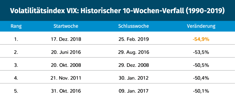
Source: CBOE
But what was the trigger for the global turnaround in capital markets?
An explanation that is frequently used is that central banks, especially in the US but also in the Eurozone, seem to have changed course and are now taking a more expansionary stance again. This can be seen, for example, in market expectations for future interest rate levels.
In November, capital markets were still firmly assuming that the US Federal Reserve would continue to raise interest rates in 2019. The priced-in probability for an interest rate hike stood at up to 90% at that time, while the probability for a rate cut was only 1%.
Just a few months later, this picture has completely reversed. At the end of the first quarter of 2019, the market valued a Fed rate cut in the current year at 70% probability, while another hike is now completely priced out.
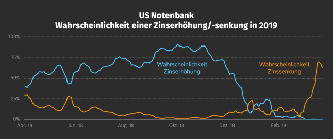
Source: CME Group, as of 03/04/2019
But while this turnaround brought spring feelings to many portfolios, some market participants warn of unwanted side effects.
The yield curve myth – what truth is there in the recession indicator?
One of them: at the end of the last quarter, the yield curve in the US inverted, meaning that yields on short-term government bonds were higher than those on long-term bonds. This is often seen as a signal of an impending recession.
Under the standard rules of the financial market, interest rates behave as follows: the longer the loans a bank grants to its customers, the higher the interest they have to pay for it. This is simply justified by the fact that the bank has to wait longer to be repaid the loaned money and is therefore exposed to a higher risk.
If you plot interest rates across different maturities on a graph, the result is typically an upward-sloping curve, which is also called a yield curve. Looking at the somewhat simplified yield curve of German government bonds (Bunds), this system can be observed beautifully. While shorter-term bonds of between three and five years inclusive trade at a negative yield of around -0.54% p.a., investors in longer-term bonds of over 15 years are compensated with a yield of around 0.39% p.a.
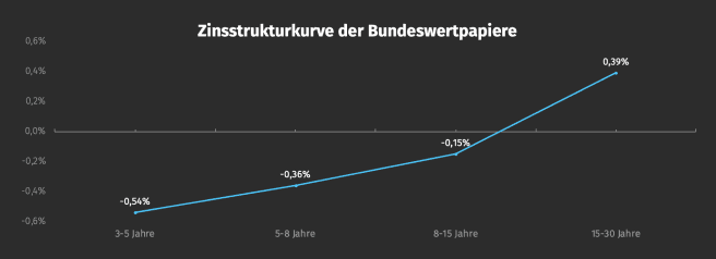
Source: Deutsche Bundesbank, as of: 31/03/2019, Link
However, the logic of financial markets would be too simple if interest rates always behaved exactly this way. Sometimes interest rates on financial markets are more or less upside down. In this case, short-term interest rates are higher than long-term ones – the yield curve is therefore declining over time, or inverted. Currently, US Treasury bonds over five years guarantee a yield of 2.31% p.a., but over a much shorter period of three months they actually yield 2.43% p.a. (U.S. Department of the Treasury, as of: 01/04/2019, Link).
This somewhat unusual relationship in the US is seen by many as a harbinger of a cooling economy. After all, this was the case before each of the last nine recessions in the US.
But what truth is there in the recession indicator?
For a deeper analysis, looking at the so-called yield spread between long-term and short-term government bonds is helpful. The yield spread is nothing other than the difference between the yield of the 10-year government bond and the yield of the 1-year or 2-year bond. If this value falls below zero, we are in the situation of an inverted yield curve as explained above. The chart shows that in the past, the US yield curve has always inverted ahead of recessions.

Source: Federal Reserve Bank of St. Louis
Nonetheless, there are many reasons that argue against this oft-cited recession indicator. For example, many experts note that primarily technical reasons are responsible for the current situation in the bond markets. The Fed's monetary policy was extremely expansionary for a long period after the financial crisis. Although the central bank has now ended its bond-buying programme, it still has an immense stock of US government bonds on its books that has yet to be reduced.
The accuracy of the indicator also leaves a lot to be desired. While each of the last nine US recessions was preceded by an inversion of the yield curve, conversely, not every inversion was followed by a recession. For example, the yield spread was briefly negative in the summer of 1998, but there was no recession in the subsequent two years.
Historically, the yield curve has also provided no clues as to exactly when a recession will occur. In the early 1990s, about 17 months passed between the yield curve inversion and the recession. In the case of the dot-com bubble, this interim period was 11 months, and in the case of the financial crisis in the last decade, a full 23 months passed before the economy found itself in a recession in December 2007.
Investors should therefore critically question the often-cited predictive power of yield curves. Economic developments cannot be predicted with certainty. And even if recessions could be reliably predicted, the most important question would still remain unanswered: how would the markets react?
Performance of the Ginmon portfolios – The most profitable quarter in Ginmon's history
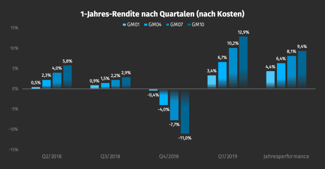
On 31 March 2019, the most profitable quarter in our company's history came to an end. Since our portfolios did not lose momentum in March after the exceptionally positive months of January and February, our investors were able to post gains of between 3.4% and 12.9% after costs.
Source: Ginmon
However, as Ginmon investors know that a single quarter is not decisive for long-term wealth accumulation, we always take a look at our 3-year net return. While our offensive portfolios shine with a performance of up to 31.2%, our very conservative GM01 strategy also boasts a respectable return of 4.7% – significantly more than could have been earned with any instant-access savings account over the last three years.
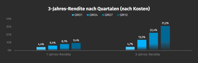
Source: Ginmon
To give you a better understanding of why our portfolios ultimately ended up with these exact returns, it is helpful to break them down into the individual performance drivers. This clearly shows to what extent different asset classes and factors determined the performance of a portfolio. We have illustrated this using the GM01, GM04, GM07 and GM10 investment strategies as examples.
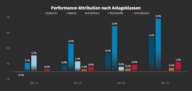
Source: Ginmon
It is clear that over the past quarter, every asset class contributed positively to portfolio returns. In particular, the furious start to the year in the equity markets was reflected in strategies with 1.1% to 6.9%. It is interesting here that equities were responsible for about one-third of the total quarterly return of 3.4% even in the very conservative GM01 portfolio, despite the equity allocation in this strategy being only 8%.
Our allocation to factors also paid off, with returns of up to 4.4%. Commodities and real estate also performed positively, collectively contributing up to 1.7%.
Bond yields under the microscope
Since central banks and their interest rate policy were particularly in focus in the past quarter, it is worth examining the performance contribution of the bond asset class even more closely. Let us take a look at two strategies with higher bond allocations of 88% (GM01) and 57% (GM04) respectively:
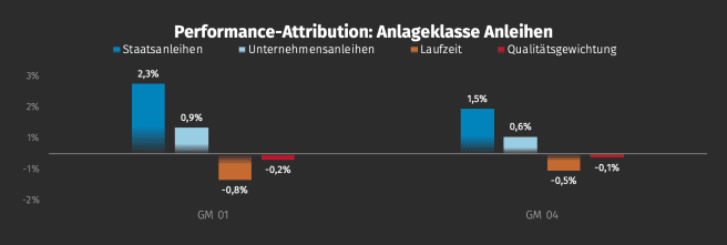
Source: Ginmon
It is striking that the allocation to government bonds accounted for virtually the entire return contribution of the first quarter for both portfolios. Corporate bonds also made a positive contribution to performance, but this was eaten up almost one-to-one by the negative contribution from duration.
In our strategies, we mainly rely on bonds with short remaining terms, which, however, performed worse in the first quarter than long-term bonds. This is explained by the previously discussed inversion of the yield curve in the US, where long-term bonds now yield less interest than short-term ones. Since lower interest rates match higher prices for bonds, these securities performed particularly well.
In addition, we focus primarily on securities of very high quality. This slightly reduced performance over the past three months as lower-quality bonds increased in value more than high-quality ones. Bonds with low credit ratings benefit particularly from low interest rates, as they are mostly issued by companies or sovereigns that are already highly indebted and would cope less well with rising interest rates. The outlook now priced in by the market for a key rate cut by the US Federal Reserve therefore gave these securities tailwind.
Company developments
Not only our client portfolios, but also Ginmon as a company has evolved encouragingly in the past quarter. Some of you might have already noticed: this week we were able to present to you some small but fine extensions to our client area. For example, an expanded inbox and the option to cancel orders after they have been placed.
Furthermore, we were delighted to receive two more awards. Recently, we were chosen by the US business magazine Forbes as one of the 100 most innovative startups in Germany as part of "The Hundred" project. In the major 2019 Robo-Advisor test of the leading investor magazine for ETFs, EXtra-Magazin, we were also able to finish with top marks and the maximum points score. With these developments backing us, we are already excited about an eventful and hopefully positive spring and summer quarter 2019.
Die Inhalte dieses Artikels stellen keine Anlageberatung oder Aufforderung zum Kauf oder Verkauf von Finanzinstrumenten dar. Dieser Artikel ersetzt keine Rechts- oder Steuerberatung und dient ausschließlich Diskussionszwecken. Die in diesem Artikel vertretenen Meinungen stellen die aktuelle Einschätzung von Ginmon dar, die sich ohne vorherige Ankündigung ändern kann. Ginmon übernimmt keine Garantie für die Richtigkeit und Vollständigkeit der dargestellten Informationen. Frühere Wertentwicklungen sind kein verlässlicher Indikator für künftige Wertentwicklungen. Geldanlagen am Kapitalmarkt sind mit Risiken verbunden. Bitte lesen Sie unseren Risikohinweis.